Monthly Archives: February 2014

People Move to Suburbs Because They’re Cheap, Volume 1

As part of trying to keep track of larger trends, I’m following the suburban development homes being offered by the major builders. Partly, this is because others (like Curbed) are already keeping good tabs on development in LA County. But also, urban redevelopment projects tend to be more unique, depending on the specific developer goals, location, land costs, difficulty of permitting, and so on. In the suburbs, we can look at projects in different communities by the same developer, which makes it easier to compare costs across communities, or we can look at projects in the same community by different developers, which makes it easier to compare developers.

In this post, I’m going to take a quick look at some different developments by D.R. Horton, which as of late February has 33 developments in some stage of progress in LA, Orange, San Bernardino, Riverside, and Imperial Counties. Of these, 19 were in Riverside County, highlighting the uneven nature of the recovery. Note, D.R. Horton doesn’t put prices for all models on their website, so I’m making some reasonable assumptions indicated by with a ~, e.g. assuming that “high 200s” is about $290,000.

Now, you can get different customizations and finishes, but the big home builders are basically working off a few common plans they’ve developed. Peruse D.R. Horton and you’ll see a 2,798 SF option pop up regularly, priced as follows:

  • Indio (Mountain Estates): ~$315,000
  • Murrieta (Iris): ~$385,000
  • Temecula (Morgan Heights): ~$500,000
  • Eastvale (Noble): $550,400

Those are all in Riverside County.

Nothing too surprising here. Temecula is closer to San Diego County than Murrieta. Eastvale is one of the closest Riverside County cities to Orange County. Indio is the suburban fringe of the Coachella Valley. In other words, location matters, just like you’d expect.

There’s a common thread of urbanist thought that goes something like “operating a car costs about $8,000/yr, so you can afford to pay more for housing if you live in a place where you don’t need a car”. This has been extended to suggest that banks should consider household transportation costs when deciding if they should make loans, i.e. if household needs one less car, they can afford a larger loan. And indeed, the difference between Murrieta and Temecula at current 30-year fixed rates (4.35%) is about $6,950 per year – about the same as the cost of operating a car.

So let’s say that living in Temecula instead of Murrieta would let one person in the family bike to work instead of drive, allowing the family to get rid of a car. Why wouldn’t a bank give the family a larger mortgage to buy the same house in that case?

Because it’s a 30-year loan, and few people work in the same place for 30 years. If the person working in Temecula in the family living in Temecula loses his/her job and finds a new one in Menifee, now the family needs another car. Or, if the person loses his/her job and can’t find a new one, there’s no way for the family to quickly reduce its fixed expenses. If the person working in Temecula in the family living Murrieta loses his/her job and can’t find a new one, the family could reduce fixed expenses pretty quickly by selling a car. Simply put, it would be crazy for a bank to make a 30-year loan that depends on transportation costs being stable.

To finally reach my point, the real tradeoff that you make when you decide to live closer to the city is housing size: you accept a smaller dwelling in order to be closer. For example, you could get a 2,414 SF house in Fontana for around $390,000, or you could get an 1,851 SF townhouse in Rancho Cucamonga for about the same price. Of course, this pattern is distorted by zoning and other things like Prop 13, which encourages communities to try to drive up housing prices.

If you look at things on a per SF basis, prices increase as you move towards the more desirable areas, and there will be thresholds at which more expensive types of construction become feasible. While prowling around Save Marinwood and Quiet and Safe San Rafael, I found a presentation by John Burns that gives relative costs of construction: about $60/SF for SFR, about $90/SF for garden apartments, and about $200/SF for podium construction.

D.R. Horton’s most affordable properties, in Adelanto and Imperial, are selling for about $100/SF, around 165% of construction costs. Assuming that zoning allows for it, and market conditions and regulation don’t favor buying over renting, that means garden apartments become economic when prices hit about $150/SF, and podiums when prices hit about $330/SF.

The threshold for garden apartments is pretty low; based on D.R. Horton’s SFR pricing, they already make sense in places like Fontana and Murrieta. Podium construction has a higher threshold; Santa Clarita is getting close, but only LA and Orange County pencil out. Note that this is a gross simplification. Small (1-2 person) households often don’t want dwellings as large as SFRs. In a place like Adelanto, a lot of single people could be accommodated in things like garage apartments, let rooms, and so on, if permitted. At small dwelling unit sizes, prices don’t scale linearly because of fixed costs like bathrooms and kitchens, which are more expensive per SF than bedrooms or living rooms.

However crude it is, this analysis is consistent with the expectation that there is a logical progression of densities as you approach more desirable areas: SFRs to garden apartments to podiums.

I should point out that by this logic, high-rise construction doesn’t make sense until prices go above about $500-$600/SF – a level that only some places in LA have reached. Not to beat a dead horse, but I feel compelled to again emphasize that the debate is not about the aesthetics of mid-rise versus high-rise construction. It is affordability versus unaffordability. If your vision is high-rises instead of mid-rises, your vision is an unaffordable Los Angeles. There’s no two ways about it.

Compete With Arterials, Not Just Freeways

In the US, we often mentally organize cities by their freeways, and consequently we often conceptualize potential transit as mimicking the freeway network. Hence we think of north-south transit between the Westside and the Valley as “the 405 Line”.

But as Cap’n Transit would remind us, transit is competing with parallel facilities like freeways. If the freeway is a total basket case, like the 405, you’ll probably do fine. But in a place like Orange County, even the heavily traveled freeways are going to offer faster average speeds. Where transit and freeways compete, freeways often come out on top, partly because medium distance trips are the sweet spot for freeways – trips that are long enough to make freeway access time worth it because of the higher speeds freeways offer.

However, transit is also in competition with arterial roadways, mostly for trips for which freeways can’t compete. These are shorter distance trips, where it’s not worth the time to get to and from the freeway, as well as medium distance trips where there’s no freeway available. In fact, even in LA County, the best performing LRT lines are the ones that are not directly in competition with a freeway: the Blue Line is somewhere between the 110 and the 710, and Expo Line Phase 1 is about a mile from the 10 (and benefits from the truly abominable traffic). Meanwhile, the lines that directly compete with a freeway (the Green Line and the 105, the Gold Line and the 110) achieve fewer boardings per mile.

It follows that we could find some clever and unexpectedly successful LRT or BRT routes by looking for long, straight arterial corridors that are serving short distance trips and medium distance trips where there’s no freeway available. In fact, we already saw a couple such potential routes when we looked at Sepulveda Pass/LAX transit: Reseda, Balboa, and Lincoln are long arterial corridors where there’s no practical competing freeway.

Where else do we have potential corridors like this? Here’s a few that come to mind:

  • Beach from Huntington Beach through Westminster and Stanton to Buena Park (or maybe La Habra)
  • Harbor from Newport Beach and Costa Mesa through Garden Grove and Anaheim to Fullerton (or maybe La Habra)
  • Florence from Westchester through Inglewood, South LA, Huntington Park, and Bell Gardens to Downey
  • Lakewood from Pico Rivera through Downey, Bellflower, and Lakewood to Long Beach
  • Hawthorne in Torrance
  • PCH from LAX to Long Beach
  • Imperial from Norwalk through La Mirada and Brea to Yorba Linda
  • Whittier from East LA through Montebello, Pico Rivera, and Whittier to La Habra
  • Azusa from Industry through Covina to Azusa
  • Rosemead from South El Monte through Rosemead and Temple City to East Pasadena

arterials

At the moment, I’m finding the first two the most intriguing. The others are good candidates for sure, but I like the idea of a sneaker route in Orange County, connecting the beaches to Metrolink. Beach is a good five miles from any competing north-south freeway. Harbor probably has better destinations but is closer to the 55 and the 57.

The problem to watch out for with routes like this is making sure there’s enough development to justify the route. Odds are the biggest destinations have freeways between them, but you can still find routes that make sense. I may revisit one or several of these corridors in more detail in the future.

Why Does US Transit Cost So Much?

Why is the cost of building transit projects in the US anomalously high? Alon Levy has been doing yeoman’s work at this for a while, and in the last year or so it’s received attention from more prominent writers, like Stephen Smith of Market Urbanism and Matt Yglesias.

Step 1 is admitting you have a problem. So it’s important for people with a national platform to keep hammering away at increasing recognition of the issue. For the more technically inclined folks (read: academia and the blogosphere), the logical next step is trying to figure out why we have a problem.

In that spirit, here’s a first shot at enumerating the reasons, along with a brief description of each. Getting to the bottom of this problem is not going to be easy – it’s going to involve investigating each of these factors in detail. That means talking with people all over the world about how they approach, design, and construct transit projects, and breaking down where costs come from. But it’s something that needs to be done. As the federal government cuts its involvement, cities are increasingly relying on self-financing. Building more transit for less money is critical to making the projects worthwhile and building public trust. It has to be done.

Some of these are probably non-factors. Others probably make in difference in some places but not others. This is just a first attempt at identifying things to look at. Without further delay. . .

Lawyer Up

We pretty much have to start here, don’t we? Others have suggested that high costs are a feature of common law systems. Any major transit project in America is at risk of getting sued. The ridiculous California v. All Persons Interested case where the CAHSRA preemptively filed suit against, theoretically, the entire world pretty much sums it up. In addition, threat of lawsuit is going to be a common contributing factor in many of these potential reasons.

Lack of Agency In-House Talent

Back in the 50s and 60s, state DOTs did a lot of their highway engineering in-house – the iconic LA interchanges, the most advanced of their time, were done by Caltrans. Same goes for the privately operated railroads; in their heyday, they had big in-house engineering departments. Today, virtually all project management, design, and construction oversight is done by outside consultants, and consultant advocacy groups lobby government officials to keep it that way.

The use of outside consultants is not necessarily a bad thing. You could argue that it just reflects increasing economic specialization, and spares the agencies the need to hire people for a specific project and lay them off when the project is done. That’s especially true for things that agencies don’t do a lot or do consistently, like building transit projects.

The problem is that most agencies now have little in-house talent, so they may not know if their consultants are doing a good job or not. This is true from the bottom, where agency engineering positions pay less than outside consulting and consequently make it difficult to retain talented people, to the middle, where agency PMs are likewise paid too little, to the top, where some agencies are run by political appointees who don’t know enough about transportation.

Depending on your political persuasion, you might blame this on (a) government work rules that make it impossible to get rid of incompetent employees or (b) consistent underfunding that prevents agencies from offering pay that could compete with the private sector. Both are probably factors in varying degrees. Either way, the result is that you end up with. . .

Consultants Checking Consultants Checking. . .

The organizational structure of a major transportation project today probably goes something like this: the agency hires a program manager consultant to study the project and take the design to a preliminary level. The agency then hires another consultant (or a design-builder) to complete the design. That consultant’s work is checked by the program manager consultant or a third-party consultant that the agency has contracted for design review. When the project goes to construction, yet another consultant is hired as the construction manager, to oversee the contractor’s work.

Combined with sparse in-house resources, this creates the potential for wasting public money. To understand why, you need to consider consultant motivation.

Consultant Conflicts of Interest

Many people seem to assume that consultants are interested in getting projects accomplished as efficiently and cost-effectively as possible.

But what is the consultant’s motivation? Really, like any private firm, the motivation is to get paid as much money as possible for as little work as possible. If agencies don’t have the in-house talent to know what their consultants are doing, they might end up paying more than they should. This motivation goes right down to low level employees in consulting firms. Businesses have profitability goals, and that means consulting firm staff have billability targets – that is, they must charge a certain amount of their time to particular projects. Staff know that if they don’t hit their billability target, they’ll eventually get laid off, so their personal incentive is to charge projects as much as they need to in order to hit that target. Better to have a job and go ask the agency for more money than be out on the street, right?

Consulting firms also set up different teaming arrangements with each other on different projects to take advantage of differing specialties among firms. This creates a natural conflict of interest where Consultant A is reviewing Consultant B’s work on one project, but hoping to get on a team with Consultant B on another project. Engineering consulting is a small world, and you can’t afford to be on bad terms with other firms if you hope to team with them for other work. Contrast that with agency in-house review, which has no such conflicting incentive.

Consultant Liability

As anyone in private business knows, one of the fastest ways to lose money is to get hit with lawsuits. For example, if someone gets hit by a train at a grade crossing, they might sue the railroad, the engineering firm that designed the grade crossing, the contractor that built it, the manufacturer that made the equipment, or any combination thereof.

Public agencies often enjoy liability limits set by the state, but consultants don’t. If you work for a consultant and you propose something that doesn’t meet standards (MUTCD, AASHTO, AREMA, NFPA, whatever they may be), your boss may ask you something like “and what’s your answer going to be when you’re on the witness stand and the plaintiff’s lawyer asks you why you didn’t meet the standard?”

Again, think of the consultant’s motivation. If they design everything to standard and it costs extra money, it’s not their money that gets spent. If they design something that doesn’t meet standards, they potentially expose themselves to significant liability. What would you do? There’s a reason some consultants think the best project is the project that never gets built.

Interagency Graft

One of the most frustrating things about transportation projects is that they require coordination between many different government agencies. A transit project probably involves, at minimum, the regional agency responsible for building transit, city DPWs or DOTs, water & sewer districts, utilities, and perhaps a state transportation agency. Theoretically, these agencies are all part of the same team. In practice, agencies often operate as fiefdoms, each defending its own turf and trying to extract concessions from others.

For example, let’s say I’m the head of a DPW, and you’re the transit agency who’s going to build a surface running LRT. I’m years behind on my pavement resurfacing schedule, and the sidewalks on the street you want to run on are a disaster. Half the loop detectors at my traffic signals are broken and the controllers are 40 years old anyway. By rational accounting, your project should only owe me for the present value of my decrepit infrastructure. But guess what? You need a permit from me to work in my ROW. So it looks like you just bought yourself full depth reconstruction of my road and all new traffic signals.

We caught a glimpse of this recently when the cost estimate for the LA Streetcar doubled due to utility relocation, which opponents pounced on to question the project and proponents protested as unnecessary. Regardless of what you think of the project, it’s likely that utilities, both public and private, will try to squeeze as much new infrastructure out of the streetcar project as possible. OPM, dude.

Intra-agency Graft

Different departments within an agency might try to do the same thing. In most agencies, capital projects are a separate department from operations and maintenance. This can impact projects in two ways. First, as with interagency demands, the costs of backlogged maintenance can foisted onto the capital project. For example, the MBTA Green Line Extension is probably going to have to do work on the century-old Lechmere Viaduct, despite the fact that repair work was done only 10 years ago and the work isn’t necessary for the extension (other than that if the viaduct falls down, the extension will be useless).

Second, maintenance and operations departments might ask for capital infrastructure on the new project to make their lives easier. For example, the Red Line, Blue Line, and Gold Line don’t have crossovers between every station. But the Expo Line does. That makes maintenance work easier and facilitates single-tracking for operations, but are all those crossovers really necessary?

Make Hay While the Sun Shines

The old saying goes that politicians see about as far as the next election. It follows that transit agencies, which are often political entities, might have about the same planning frame. Also, because US politicians seem to lurch from crisis to crisis, throwing money at problems only when they become severe, agencies may operate in a feast or famine mode.

That means that when they have money, they are often anxious to spend it. In the absence of reliable long-term funding and planning – like, say, Measure R – the incentive is to spend the money before someone like Chris Christie or John Kasich gets elected and pulls the plug on the whole thing.

Preemptive Mitigation

The potential for lawsuits can induce preemptive mitigation measures for two reasons: first, if you give opponents enough, they might not sue you. Second, if they sue, you can show that you’ve made a good faith effort to reduce the impact of your project. Maybe you don’t really need four-quadrant gates and quiet zones; maybe it’s really not worth it to build retaining walls to save a few square feet of wetland. But you do it anyway to try to avoid potentially larger costs of lawsuits and delays.

Legally Mandated Mitigation

If you get sued, there’s always the possibility that the court could impose costly mitigation measures. For example, Metro had success in defending the Expo Line against lawsuits demanding grade separations at Farmdale, Overland, and Westwood. As it is, Metro was forced to build another surface level station at Farmdale (not cheap, but low impact in terms of price per mile) and got stuck with a nuisance speed restriction. But if those cases had gone the other way, the costs would have been much higher.

Union Rules

I don’t know much about union rules, but it’s been suggested elsewhere that unique characteristics of US unions & work rules result in very inefficient use of labor. Certainly, on the operations side, unions consistently oppose labor-saving reforms. Unions have probably also been conditioned to try to get as much work for their members as possible while the political winds are favorable.

Crappy Transit Activism

I don’t know anything about transit activism in countries outside the US. But there are people in the US that will defend transit projects no matter how poorly they are planned and/or executed. Alon Levy already wrote about this issue so I won’t go into more detail.

Coattail Riding

Lastly, huge public works projects are convenient places to tack on other desired improvements that might seem expensive in their own right, but aren’t that much relative to the big project. For example, the MBTA Green Line Extension project might end up building part of the Somerville Community Path, and the Expo Line Authority is building some of the Expo Corridor bike paths.

That’s not to say those are bad projects; I’m all for the Expo bike paths. But as a matter of accounting, that adds unrelated costs to the transit project.

Next Steps?

That’s about all I can think of for now. Again, this is just an attempt to identify potential causes for high US transit costs. Some may not be factors, some might be inconsequential factors, and no doubt I’ve forgotten others. If any transpo grad students out there are looking for research topics, feel free to take up a couple of them 😉

Update 3/12/14:

On Twitter, The Tysons Corner suggested that public cost estimates early in the process (conceptual design, preliminary engineering) set a floor for contractor bids. IMHO, that is a valid point – after all, the motivation for contractors is not to submit the lowest possible bid, but a bid $1 less than the second lowest bidder. You often hear contractors talk about how winning bidders “left money on the table” when there was a big spread between the lowest and second lowest bids. On the other side, engineers hate getting burned by costs coming in too high, so they’re motivated to inflate their estimates early on in the process. However, as long as these projects are being built by public agencies, the documents are public records, so I don’t see any way out of publishing some sort of cost number at each stage of design, and cost is obviously an important factor for the public to decide if the project is worthwhile.

LACMTA Rail Ridership Update – January 2014

People seemed to like the rail ridership update last October, so let’s make it a quarterly thing. That conveniently lets this edition include January 2014, getting a “real” month of data (not affected by major holidays like Thanksgiving or Christmas).

First, the raw data:

rawdata-201401

Blue Line for December 2013 and January 2014 is anomalously low. Red/Purple Line is pushing all-time highs. Like the Blue Line, the Gold Line was a little weak to finish out the year. Expo Line Phase 1 ridership seems to have stabilized at about 27,000 on weekdays – beating 2020 projections by over 10%. Again, the Blue & Green Line data for late 2012 is questionable – but it’s all we have to go on.

Interestingly, all lines posted strong weekend ridership over the last 3 months. Green Line broke 30,000 on Saturday and 20,000 on Sunday for the first time. Likewise, Gold Line broke 30,000 on Saturday and 25,000 on Sunday, and Expo Line broke 20,000 on Saturday and 16,000 on Sunday. Red Line broke 110,000 on Saturday but both Red & Blue Lines were very weak on Sunday.

Here’s the rolling 12-month average:

wkdy-12mo-201401

The dips in the Blue & Green Lines are due to the questionable data from late 2012 falling out of the rolling average. We probably won’t really know the meaning of that data for at least another 6 months.

Again, boardings per mile is a better way to look at productivity. Here’s the update for that (I’ve gone to a rolling 12-month average here too):

wkdy-bpm-12mo-201401

Expo Line is starting to level off a little bit. As I’ve said before, I expect it to increase when Phase 2 opens.  On the other hand, Gold Line will probably fall off when Foothill 2A opens, because that piece will probably have lower productivity per mile.

Another potentially interesting thing to look at is how Saturday & Sunday ridership stacks up against weekday ridership. Here’s the raw data for the boardings per mile:

rawdata-bpm-201401

And here’s Saturday & Sunday boardings, as a percent of weekday boardings, based on the 12-month rolling averages.

Sa-bpm-percent

Su-bpm-percent

Unfortunately, the results prove to be more chaotic than hoped for, so it’s hard to see any trends. Given how variable the data is, take these notes with a big grain of salt. Expo Line is closing in on Blue Line weekend boardings per mile more quickly than for weekdays. Its rolling 12-month average for Saturday is up to about 75% of weekdays, better than any other line.

Blue and Expo Lines both have Sunday ridership about 55% of weekdays, while the other three lines are about 45%. Note that the Gold Line started with higher weekend percentages, which then declined as weekday ridership grew faster than weekend ridership (even though ridership was growing for all days). It will be interesting to see if Expo Line weekend ridership percentages hold up or decline the same way.

Why Are Highways Numbered to Satisfy Road Geeks?

In the US, we generally sign three different kinds of numbered highways: interstates, US routes, and state routes. In some states, there are also signed numbered county routes, but we’ll ignore them for now.

The numbering schemes for interstates and US routes (generally) follow some basic rules:

  • Two-digit routes are main routes (one-digit routes are understood to be included here).
  • Odd numbered two-digit routes go north-south.
  • Even numbered two-digit routes go east-west.
  • Interstate numbers increase south to north and west to east.
  • US route numbers increase north to south and east to west.
  • Three-digit routes are of the form “xPP”, and are supposed to connect to their “parent” two-digit route “PP” somehow, e.g. US-119 is supposed to connect to US-19.
  • Furthermore, the “x” for three-digit interstate routes is supposed to be an odd number if the route is a spur that connects to the parent only at one end, and even if the route is a loop that connects to the parents at both ends. For example, the I-405 freeway connects to the I-5 freeway at both ends, while the I-710 freeway only connects to the I-10 freeway at one end. . . sort of.
  • Two-digit numbers are almost never used in more than one place. Three-digit numbers are reused.

That’s all well and great. . . if you’re trying to make road geeks happy. In fact, road geeks get angry about routes that do not follow the numbering system; see the fury drawn by I-99 and the US-4xx routes if you don’t believe me.

Problem is, satisfying road geeks is a pretty strange goal for your highway numbering scheme. The purpose of building highways, as I understand it, is to facilitate the movement of people and goods. Highway numbering should promote that purpose. No one is out there driving around aimlessly looking for the 5, and, upon finding the 405, feeling relief that the 405 must take them to the 5. Actually, thanks to some rule-bending, a person depending on the numbering scheme would find themselves hopelessly lost in many places; consider, for example, that the 278 in New York doesn’t connect to the 78 anywhere. . . it doesn’t even come close.

Worse than that, in some parts of the country, the insistence on trying to follow the scheme makes things more confusing. The two prime examples of this have to be the Bay Area, which has only one two-digit interstate (the 80) and is therefore drowning in a sea of x80’s (the 280, the 380, the now-defunct 480, the 580, the 680, the 780, the 880, and the 980) and the Hampton, VA area (the 64, the 164, the 264, the 464, the 564, and the 664). When you roll up the 101 into San Jose, do you benefit from having to choose between the 280, the 680, and the 880? Of course not. Some states have implicitly admitted this; see, for example, that Maryland doesn’t sign the 595, realizing that the DC/Baltimore area, and the Northeast Corridor in general, already has plenty of x95’s.

So what would a logical highway numbering system look like? Well, the first thing it should do is communicate the quality of the road to you using the route shield. We have that a little bit with interstates – when you see the red and blue shield, you know you’re getting a freeway. But, in the same way that not all rectangles are squares, not all freeways are interstates.

overhead1

So, any limited access facility should get the interstate shield. In the sign display shown above, the 5, the 101, and the 60 are all the same quality of road. They are all completely controlled-access freeways. The 39, which is implied to be just as good as the 60 by its route shield, is just a regular surface road.

overhead2

Ahh, much better! You’ll note that I didn’t bother to change the 101 and the 60 to follow the interstate numbering scheme, even though there are numbers available (the 60 could be the 410, the 610, or the 810, and the 101 could be the 705). That’s because the interstate numbering scheme is pointless. There’s no logical reason that numbers have to increase south to north and west to east, and there’s no logical reason to not reuse numbers if they’re separated by a large distance. The 57 freeway should just become the I-57 freeway. No one is going to get confused and think they are in Cairo, IL instead of Orange County.

That takes care of freeways, which should all get the interstate shield, and state routes, which should be normal arterial roads. What about US routes? They should be used for major cross country routes that aren’t freeways. The current scheme basically allows the use of the US route shield if the route crosses a state line, which leads to the ridiculous scenario where the 199, at 80 miles long and serving the middle of nowhere in California and Oregon, is worthy of a US route shield, while the 99, which is over 400 miles long, is mostly freeway, and serves Chico, Sacramento, Stockton, Modesto, Fresno, Manteca, Bakersfield, and LA (almost) isn’t. The 199 probably does not deserve to be a US route. The 99 does.

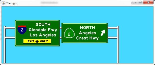
Really, a lot of the 99 should be an interstate. The parts that are a freeway should use the interstate shield. The parts that aren’t should use the US shield. There’s no reason that one consistently numbered route has to use the same shield the whole way. Using different shields would help drivers understand that, say, the Angeles Crest Highway and the Glendale Freeway aren’t the same kind of road, even though they’re both part of the 2.

overhead3

Nothing wrong with that signage.

There is another legitimate reason to do this: it takes godlike transportation power away from highway geeks (AASHTO) and faceless, unaccountable hacks (Congress). The interstate shield, because it symbolizes quality roadway transportation, carries a lot of weight, and states are willing to spend money to get it. That allows AASHTO and Congress to have discriminatory power to force some states to spend money for no good reason. Anyone want to make the case that it is really critical that Caltrans upgrade a few ramps on the 210 in San Bernardino before they’re allowed to throw up the interstate shield? Especially in light of comparison to laughably deficient legacy freeways like the 278 in New York and the 70 in Pennsylvania?

Granted, this isn’t a huge issue. We’ve got better things to worry about and spend money on. But as signage is replaced over time, we should move to this kind of system.

All sign images generated with Kurumi’s sign maker app.

The Heart of Palms-ness: Motor Av

I’ve written before about my neighborhood’s namesake boulevard, but the development on Palms is almost all residential. The “main streets” of Palms are really Motor and Overland. So today, let’s take a tour of Motor Av.

A word must be said at the outset: the architecture on Motor Av is not going to inspire many people. James Howard Kunstler isn’t going to write anything romantic about its earnest ornamentation reflecting the city’s work ethic or how the repetition of a pattern in the street room delights the eye. Whatevs, streetscapes are relatively easy to improve. The real thing to be watching here is diversity of use (residential, offices, retail, light industry, restaurants) and the wide range of building ages (everything over the last 100 years).

So if you find yourself getting caught up in the architecture, remember: you’re looking at a hard working neighborhood main street, that’s getting it done in just about every way. It’s within walking distance for pretty much everyone in the neighborhood. If, on the whole, you’re not happy with Motor Av, your primary concern isn’t diverse mixed-use neighborhoods. There’s nothing wrong with that, but part of understanding what your strategies should be is understanding what your goals are. A denser, more walkable LA is going to have more streets that function, and probably look, like Motor.

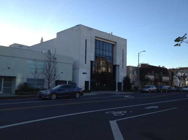
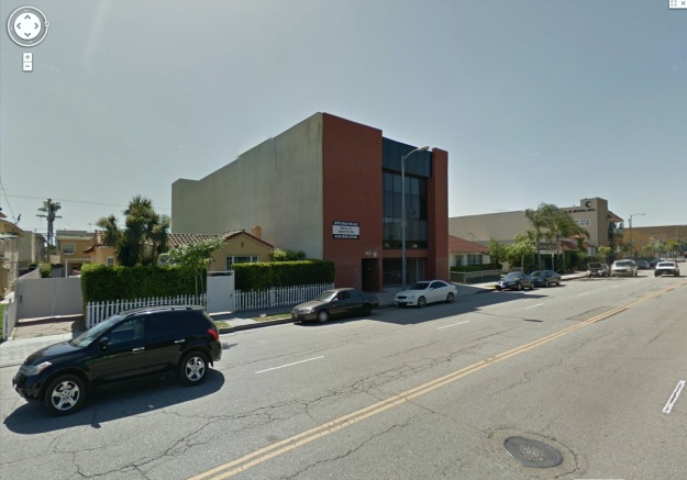
Oh, and one more thing: notice that between the Google Street View shots (2011) and my photos (2014), Motor has been converted from four lanes to three lanes with bike lanes! Alright, off we go.

Venice to Regent

Starting just north of Venice, on the west side of the street, here’s a cleaners, an antique shop, a random building, and the post office.

IMG_4548-ed

Across the street, here’s the neighborhood bike shop (in a 1923 building), a small apartment house (built 1931), and an office building (1989). Need a small affordable office for your business? Palms has you covered.

Motor-01

Just past that, there’s a landlord’s office with apartments above (1953), hair salon & roofing business (1947), and another small apartment house (1958).

Motor-02

Back on the west side, a preschool (1936) and some more office buildings (1986, 1964, 1953).

Motor-03

Across from that, we have an SFR (!), an apartment block, and a plumber (1924, 1959, 1972).

Motor-04

Meanwhile on the west side, a newish (2004) more upscale apartment building.

IMG_4554

Then, at the corner of Motor & Regent, an auto body shop (1947), some furnished single apartments (1955), the fire station (1952), and another commercial building (1957).

Motor-05

And all of that is just the first block!

Regent to Tabor

Continuing north, we have a small office building (1991) and a mid-size apartment building (1971) on the west side.

IMG_4556

And across from that, a larger apartment building (1987).

Motor-06

North of that building, there’s a series of small apartment buildings (1946, 1956, 1988).

Motor-07

Opposite that, we have another private school (1925 & 1967 buildings), a newer four-story apartment building (2006), and an old apartment building (1955).

IMG_4558

Continuing north, a 1925 SFR with a 1931 ADU, another small 80s office building (1984), and four bungalow-size standalone houses on one lot (1941).

Motor-08

A few more office buildings (1982, 1929, 1980, 1963) and a 1954 dingbat bring us up to the corner of Tabor on the west side.

IMG_4562

IMG_4564

Meanwhile, the second half of the block on the east side features an office building (1972), several residential buildings (1947, 1953, 1953, 2006, 2006), and a motel (1961).

Motor-09

Tabor to Palms

Across Tabor, we have a couple convenience stores and Laundromat; right side dates to 1923, while the left side strip mall is 1960.

Motor-10

Next up, on the west side, our second (but not our last) SFR! This one is from 1904. Next to that, a low slung 1948 apartment building and more 80s office buildings (1987, 1989).

IMG_4566

A medical building (1971), a sign manufacturing shop (1947), and a sandwich shop (1930, 1954) round out the west side of this block.

Motor-11

Almost the whole east side is occupied by Palms Elementary School.

Motor-12

Palms to Woodbine

Crossing Palms Blvd, there’s an Arco gas station (cheapest gas around as long as you can deal with their bizarre ATM card machines) on the west side, and Palms’ newest mixed-use building (2013) on the east side. Some of the retail space on the first floor has been occupied by The Wilde Thistle. . . welcome to Palms, y’all!

IMG_4568

Back on the west side, there’s the who-knows-what light manufacturing building (1950), yet another SFR (1916), an under-construction four-story apartment building (2014?), and an auto repair shop (1940s). Houston, eat your heart out.

IMG_4647

The east side has some more 1980s office buildings, a physical therapy building, and some “store & residential combination” buildings from various decades. The corner office building is 1997.

Motor-13

Woodbine to National

Ok, two more blocks to go! On the east side, three small office buildings (1910, 1940, 1961) and Iman cultural center.

IMG_4574

Also some bad ass street art.

IMG_4575

Across from that, The Garage, a solid neighborhood bar in a 1961 building, and some office buildings all over the place (30s-80s). A four-story apartment building (1988) and old-school mixed-user (1924) take us up to National.

IMG_4578

The east side has a liquor store and more genuine urban industry!

IMG_4577

Home stretch, from National to the 10. The northeast corner has a 1981 retail/office combo building. Then, some small offices including an art school (1951, 1946), and another auto body shop (1947).

IMG_4580

Motor-15

On the west side, there’s another medical building (1941), another solid neighborhood bar (The Irish Times, 1946), and some apartment buildings (1957, 1955).

Motor-16

Of course, Motor keeps going north past the 10, but I hear that’s the kind of neighborhood where they’re scared of bike lanes and worry about the spacing of poles holding up netting at a driving range. Nice architectural uniformity, but nothing interesting to see there.