Monthly Archives: November 2014

Metrolink Ridership Update – September 2014

Time for an update on Metrolink ridership, including FY15Q1 (July-September 2014) data. Here’s the breakdown of data by stations.

stations-20141127

Here’s the update of the rolling 12-month averages, broken down by line.

Ventura-20141127 AV-20141127

BG-20141127 SB-20141127 Riverside-20141127 91-20141127 OC-20141127 91OC-20141127 AC-20141127

Ridership continues to be on a troubling downward trend.

Here’s a look at the top 10 and bottom 10 stations for ridership gained (or lost) over the period from June 2010 to September 2014 (all based on rolling 12-month averages). The top 10 and bottom 10 stations are unchanged, except for Anaheim Canyon entering the top 10 and Fullerton dropping out, and Rancho Cucamonga entering the bottom 10 and Via Princessa dropping out. These are both bad changes, because Fullerton and Rancho Cucamonga are higher ridership stations than Anaheim Canyon and Via Princessa.

abstop-20141127 absbottom-20141127

Since June 2010, 43 of the 54 stations (excluding LA Union Station) have lost ridership, up from 42 of 54 at the last update. Fullerton has now gone from having an increase in ridership to a loss. 17 stations have lost more than 20% of their ridership in the last 4 years, up from 12 at the last update. With the exception of Pomona Downtown, every station that’s gained ridership is either in Orange County or on the 91/OC-IE Lines.

LACMTA Bus Ridership October 2014 – Wilshire Update

Update to the post on bus ridership: commenter calwatch noted that, since the 720 extends onto Whittier Blvd, a more proper accounting would include local boardings on the 18, which operates on Whittier and 6th. I updated the bus ridership data to include the 18; the revised graphs are below. I also created a plot for the combined Wilshire/Whittier corridor showing the breakdown of ridership between routes 18, 20, and 720. The recent decrease in ridership is largely due to a decline in boardings on route 18.

For the next update, I’ll add boardings per route-mile for these bus routes.

bus-raw-201410a bus-wkdy-12mo-201410a bus-Sat-12mo-201410a bus-Sun-12mo-201410abus-share-201410abus-split-Wilshire-201410

LACMTA Ridership Update – October 2014

Note: see the update to bus ridership here.

Another three months has passed, so it’s time for another LACMTA rail ridership update.

First, the raw data. Highlighted cells represent the top 10 months for that line (since January 2009).

rawdata-201410

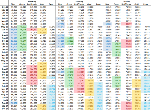
Ridership was generally up a little bit on all lines. The Green and Blue Lines remain well below their peak ridership months in the second half of 2012, as is the Red Line below peak months in 2013. Gold Line ridership remained near all-time highs, while Expo Line was flat except for Sunday ridership. Expo Line ridership was flat in the second half of 2013 as well, so we’ll have to see if 2015 brings another surge. Trends were similar across weekdays, Saturday, and Sunday, except for the Red Line on Sundays, which had some of its best numbers on record.

Here’s the rolling 12-month average of weekday ridership:

wkdy-12mo-201410

On the rolling 12-month graphic, the recent dips in Blue and Green Lines ridership look a little less troubling. The sharp drop in Red Line ridership is likely due to fare gate locking.

For this update, I decided to include the Saturday and Sunday rolling 12-month averages as well.

Sat-12mo-201410

Sun-12mo-201410

Note the sharp uptick in Gold Line ridership on Saturday and Sunday starting in July 2013, while weekday ridership is little changed. This is probably because Metro started running 7-8 minute headways on the Gold Line on weekends. While this is nice for Gold Line riders and led to a bump in ridership, you have to wonder why the Green Line – which has identical ridership overall and on a per mile basis – only gets 15 minute service on the weekend, and the Blue Line, with higher ridership, gets 10 minute service.

Boardings per mile is a better way to look at productivity. Here’s the update for the rolling 12-month average of boardings per mile:

wkdy-bprm-201410

Now Featuring Bus Ridership!

As experts like Jarrett Walker and Juan Matute have written elsewhere, an extensive, successful rail network will only be part of a successful transit network for LA. Bus will always be important. With that in mind, here’s a look at ridership trends on five of LA’s major arterials. Each arterial has both a local bus route and a Metro Rapid bus (700-series route numbers). Therefore, the ridership presented is the sum of the local and the rapid. The chosen arterials and bus routes are Santa Monica (4 & 704), Wilshire (20 & 720), Venice (33 & 733), Vermont (204 & 754), and Western (207 & 757). The Orange Line and Silver Line are also included.

Here’s the raw data, and the rolling 12-month averages for weekdays.

bus-raw-201410

bus-wkdy-12mo-201410

Orange Line and Silver Line ridership grew steadily throughout the period, and Wilshire and Venice had growth as well. Santa Monica was flat, while both Vermont and Western saw considerable drops in ridership – nearly 12% in the case of Vermont.

Here’s the Saturday and Sunday rolling 12-month averages.

bus-Sat-12mo-201410

bus-Sun-12mo-201410

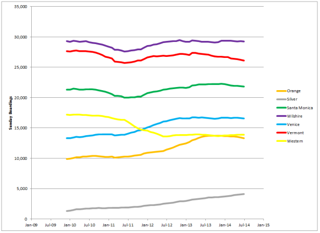
On the Saturday and Sunday graphics, we can see some interesting structural changes reveal themselves. The 733 service on Venice was introduced in July 2010, and this seems to have resulted in an increase in ridership. Meanwhile, the 757 service on Western was discontinued on weekends in July 2011, and this seems to have resulted in an immediate drop in ridership. By late 2012, ridership on both streets had leveled off. This change is also evident in weekday ridership on Venice, though not as pronounced.

Lastly, we can look at the percentage of trips on each arterial being served by the rapid route.

bus-share-201410

The 720 dominates ridership on the Wilshire corridor. On Venice, the rapid captured about 50% of ridership when introduced, and has since slipped a little. On Western, service changes in July 2011 resulted in a quick jump in rapid share, followed by a continued increase. Vermont also saw a slight increase in rapid share, though in both the case of Western and Vermont, total ridership on the corridor declined.

It’s impossible to discern what caused ridership changes from this data. An improving economy means more people have jobs, which increases ridership, but it also means more people can afford cars. Some of the neighborhoods served by these routes have been undergoing changes that often decrease ridership, such as gentrification.

There are two ideas I would feel comfortable floating out. One, because the Silver Line on the 110 is just a little over half a mile from Vermont, some Silver Line ridership may have been captured from Vermont. The Silver Line is limited by poor stop spacing, but it goes directly downtown, so it may have captured trips from Vermont that were transferring to the Red Line. Two, the Expo Line may have captured some ridership in the USC area.

The most important thing here, though, is that ridership on these bus corridors is higher than many of LA’s LRT lines. Wilshire and Vermont have more riders than any LRT line except the Blue Line. These bus routes are a critical part of mobility in LA. We’ll have Wilshire BRT, but maybe we should have a Vermont, Western, Santa Monica, and Venice BRT too.

That’s it for now, stay tuned for Metrolink!

How Does Your Grid Grow?

Every city has an underlying historical layout that shapes growth. For example, New York is dominated by a continuous grid of avenues and streets, first deployed in Manhattan in the early 1800s, then repeated again and again in Brooklyn and Queens. In Boston, development is shaped around “squares” (which might more properly be called “crossroads”), along the major roads connecting the squares, and then into local grids of varying regularity.

In Los Angeles, development is shaped by a grid of north-south and east-west arterial roads, generally on half-mile spacing. The grid is somewhat distorted by topography and historic land grants, such as the old pueblos and ranchos. While some areas have New York-style continuous grids in between the arterials, much of the city has features such as irregular grids, curvilinear streets, and jogs in the grid, all of which discourage through traffic and transit. This reinforces the importance of the arterials.

Navigating a city requires forming an internal map of this structure – where the roads go, and how well they do it. For example, if you spend a lot of time in the Inland Empire, you probably know Milliken, Haven, and Archibald, and which one isn’t continuous around Ontario Airport. If you live on the Westside, you know Pico, Olympic, Santa Monica, and Wilshire, and which ones will ruin your bus ride in the afternoon. In Boston, you might know that Somerville Ave takes you between Porter Square and Union Square, while Cambridge and Washington Streets take you between Union Square (Allston) and Oak Square. On the other hand, Manhattan’s continuous grid devalues knowledge about the east-west streets; you’re better off knowing the major streets and the few areas where the grid is disrupted, like Morningside Park.

When I started posting about north-south transit on the Westside, I found that I didn’t really like any of the readily available maps. For my eye, Google Earth and Maps are too busy, while highly stylized maps, like LA Metro’s system map, are too distorted. I wanted a map that was roughly geographically accurate, but stripped down enough to show the underlying structure. So I made my own map of the mile-spaced arterials, scaling distances in Google Earth and drafting in CAD. The original plan was to just do the Valley and the LA Basin, but I ended up doing all five LA area counties (LA, Orange, San Bernardino, Riverside, & Ventura).

This exercise was very revealing because it shows how much editorializing is involved in mapmaking. While maps are often presented as unbiased fact, the content is strongly influenced by the personal, social, and cultural background of the person making the map. Even on this map, which only includes streets, we must decide which streets are important enough to be included. As suburbia faded to desert in the Antelope Valley and farms in the Coachella Valley, I kept putting in the arterials as long as they were paved. Do Avenue A and Hayes (named for Rutherford B Hayes in one of the most extensive presidential street grids you’ll find) really belong on the map? You tell me.

This map only includes arterial roads. There are no freeways and no rail lines. Yet if you know LA’s geography, you can probably pick out many regions by their arterial structure – the regular grids of the Valley, the LA Basin, northern Orange County, and the Coachella Valley; the growth-boundary-stunted grid of Ventura County; the irregular layout of hilly areas like the Santa Clarita Valley and southern Orange County; the established grid of the older San Bernardino County cities and nascent grid of the newer Riverside County cites; the ill-defined edges of growth in the High Desert. You’ll also see features from where there aren’t roads, like the immense expanse of the San Gabriel Mountains. And finally, you might see things you didn’t realize before, like the oddly distorted north-south arterials between Main and Cherry in the LA Basin.

Despite showing only arterial roads, the map can be read in many ways depending on your point of view. Does the anticipatory grid in the Antelope Valley portend endless sprawl, or room for opportunity? Or is the lonely view along 200th Street E to Hi Vista that and nothing more? What about golf courses and subdivisions creeping southeast into the farms of the Coachella Valley?

Anyway, enjoy. Click to embiggen. . .

LAmap

Why Don’t We Build Trailer Parks Anymore?

Trailer parks are the rural and suburban answer to “the projects” in urban areas: both unfairly and fairly maligned, poorly understood, a convenient shorthand for looking down on a certain group of people.

This is really unfortunate, because trailer parks are a great way to provide affordable housing in a rural or suburban setting. Now, I’m not talking about the trailer parks that persist in places like Santa Monica because zoning and NIMBYs preclude redevelopment, with hugely subsidized rents for people like UCLA philosophy professors earning six figures. Not at all. I’m thinking about places near the suburbanizing edge of western Riverside County, like Nuevo or Hemet; places like the Coachella and Imperial Valleys, with high cost of housing burden for low income service and agricultural workers.

Popular stereotypes hold that trailers and mobile homes are shoddily built. This is probably because the housing stock in most trailer parks is pretty old. Modern manufactured homes, as the fabricators prefer they be called, are well built in a controlled factory environment, and they meet the building codes like any new construction. There’s probably a parallel with dingbats, which everyone holds to be a crappy form of construction, just because we zoned new construction out of existence and all the dingbats we have are 50 years old.

Mobile home park densities aren’t going to knock your socks off, but they’re not bad for suburbia. This large area in Hemet checks in at around 6.3 dwelling units per gross acre. Hop over to Zillow and enjoy the affordability. The lot sizes aren’t too much smaller than the classic 5,000 SF lots that were developed into low-rise apartments in places like Palms, which raises the enticing prospect of neighborhoods of mobile homes slowly getting replaced by dingbats.

Note that there are also many older subdivisions of conventional construction about the same size and comparable (or higher) densities, like say this area just west of that Hemet mobile home park. Properties there are selling in the high $100k’s, a considerable premium over the manufactured homes. Meanwhile, new conventional SFR construction in the area starts somewhere around the mid $200k’s. You can see a similar dynamic over in Menifee. Shouldn’t there be a market for new subdivisions of manufactured homes, selling at a similar discount to conventional construction?

So why don’t we build new mobile home parks? Is the market really just not there? Have communities zoned them out completely, because they attract the “wrong” kind of people? Are cities worried they’ll attract people with kids but not generate enough revenue? Other thoughts? Like low-rise apartments in cities, manufactured homes in suburbia seem to be yet another affordable option we’ve denied ourselves.